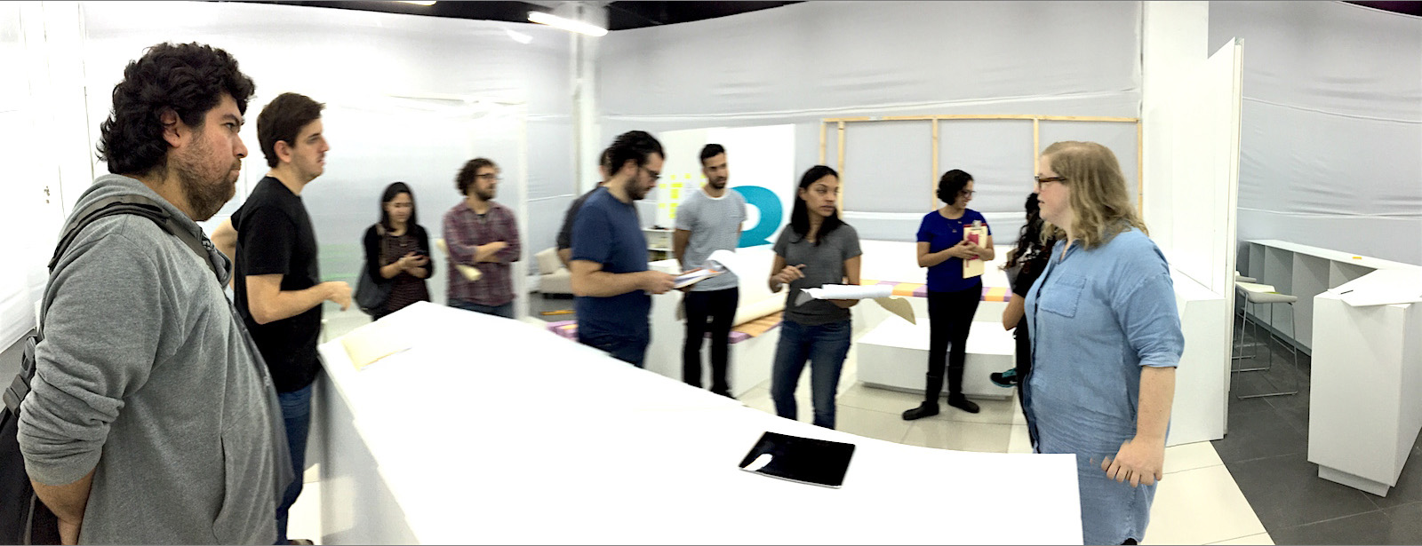
The objective was to develop a new type of low-cost, high-quality healthcare offering targeted towards the emerging middle class in Latin America. Previous studies had shown that there were serious deficiencies in most of the existing services available to that population. In the long term, this project has the potential to improve the lives of millions of citizens. We worked in interdisciplinary teams, each in charge of designing one aspect of the new service. These included:
The UX design team defined a technology roadmap, designed the user experiences for key components and established design patterns for future use. Below are examples of the main applications, which we called the Patient App, the Nurse Tool and the Doctor Tool.
My role at La Victoria Lab
User Experience Manager

The project followed a human-centered approach, having all teams performing user testing together. The digital prototypes were tested in context, in an architectural prototype. After each round, the teams revised their prototypes and provided feedback for the others.
Digital prototypes were tested using two methods. First, participants and service providers were given scripts to role-play medical consultations, after which they were interviewed. This test had the purpose of validating the value proposition and adherence to common social/professional practices. Second, participants were given task objectives for think-aloud testing in order to evaluate the design’s usability.
The patient app had two variants. The first supported treatments and managing appointments. The second was focused on maternity and included a pregnancy/neonatal roadmap.
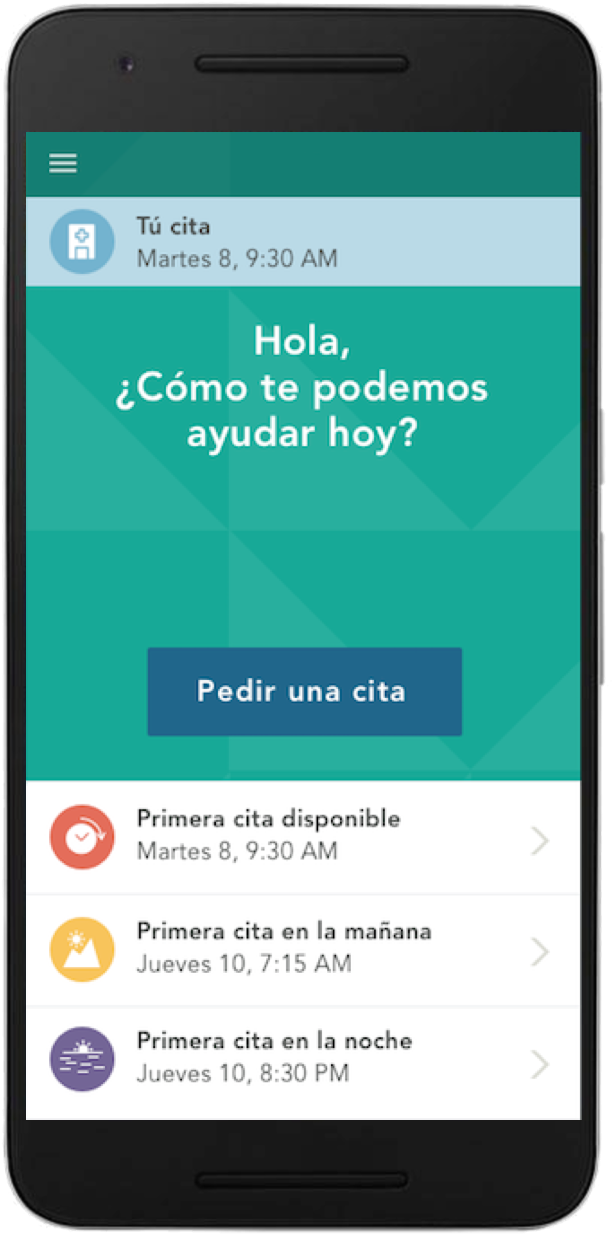
The Patient App uses context information to configure the main view. On this example, it invites the user to book a consultation. It also shows shortcut options to book the first available time, the first early morning and the first late night. Data showed many patients prefer to make their consultations before and after office hours. After triage, the app shows the patient’s vital signs. Out of range values are color coded and explained in a careful manner. We took special care in not to “diagnose” (that should be the doctor) or cause anxiety to the patient.
The Patient App supports the patient's treatment, guiding him through behavior changing, lab tests and medication. In the example above, the prescription is explained in layman terms. A simple table shows when it has to be taken. For lab tests, the app helps the patient booking and visualizing the results when medically appropriate.
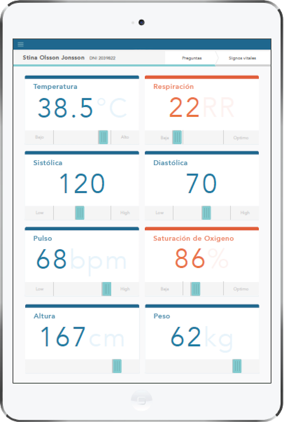
Designed to be used by a nurse technician during the triage process. It allows the capture of vital signs and supports critical actions, such as summoning a doctor for urgent care. During triage, the provider is operating several medical devices, so the app had to be used one hand, therefore the device is a wall-mounted touch screen. The interface guides him through the medical protocol, pacing each step in an established order (for example, patients need to rest momentarily in order to obtain a good heart rate reading).
This application supports the physician’s delivery of the consultation. It was built around a protocol co-designed with the medical strategy team, following the SOAP method (Subjective, Objective, Assessment, Plan) and balancing flexibility with adherence to clinical protocols. There is strong evidence that correlates the doctor’s empathy during consultation with the recovery rate of patients: supporting patient-doctor interaction, and not interfering, is critical. We also found that patients were more prone to follow their treatments if they had participated in defining them, which we also supported.
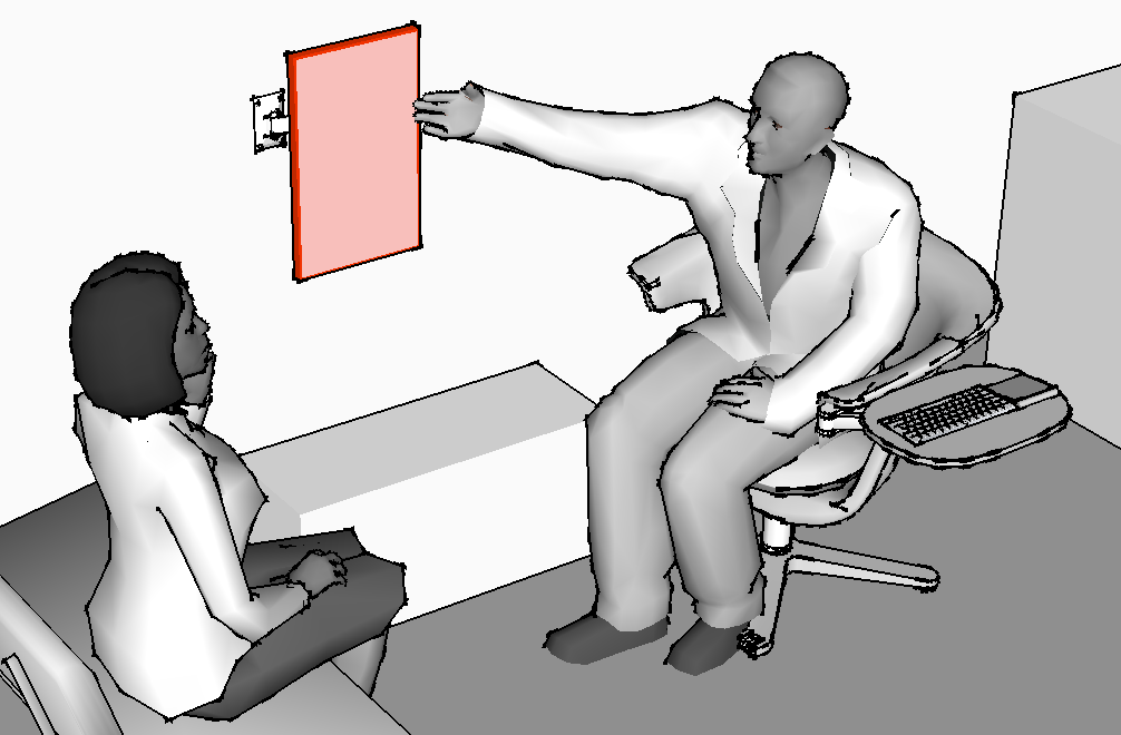
Using a shared display enhanced the experience. The doctor can swivel the screen in his direction when he needs to focus on it, but the position and vertical layout doesn’t create a barrier between him and the patient. Patients valued the moments when the doctors shared on-screen information with them.
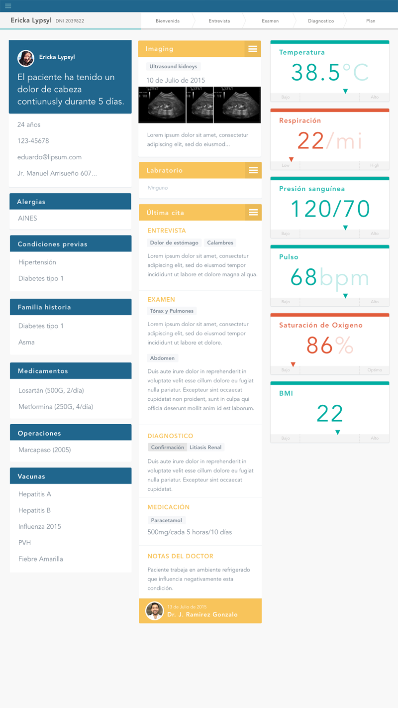
Before the patient arrives, the doctor is asked to review a summary of the medical history, which includes the vital signs recorded by the nurse during triage, current medications, conditions and treatments. Critical information, such as medicine allergies, is highlighted.
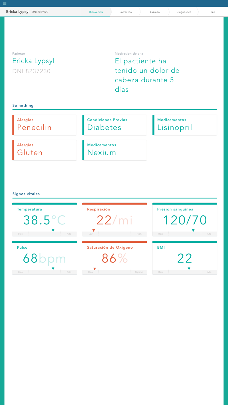
The doctor is asked to swivel the display and show the screen to the patient. The main purpose of this sharing moment is to give reassurance that the doctor is aware of all the critical information. Providing this common ground facilitates the discussion during the consultation, therefore improving the experience by a large measure. Also, the application provides guidance in performing the physical examination. In case the doctor finds a medical condition he takes annotations in free text. During testing, we evaluated the use of a more structured input (checkboxes, radial buttons, etc), but it didn’t provide the flexibility doctors needed to describe most conditions. Finally, The treatment planning is a collaborative task, where the doctor discusses options with the patient. The application recommends common treatments and shows alerts for medication interactions and contraindications, such as those related to allergies.
This project is changing the rules of the Healthcare industry in the Latin American region, by providing a service of much higher quality at lower prices. This was made possible by the application of a human-centered approach at multiple levels and domains, including business strategy, communication, systems, process, service and architecture, allowing the teams to efficiently focus in the aspects that have a mayor impact in quality as empirically observed in the delivery to the patient.
Business CEO, financial analyst, business designer
Service Design two service designers
Architecture industrial designer, experience designer, architect, two design interns
Medical two senior medical doctors
UX Design UX manager, lead interactive designer, two prototyping engineers, tech operations Manager